Selected work
A little bit of strategy. A whole lot of personality.
From hospitality campaigns and restaurant menus to brand identities, editorial design, and digital experiences, each project starts with a clear idea and a reason to remember it.
Restaurant · Hospitality
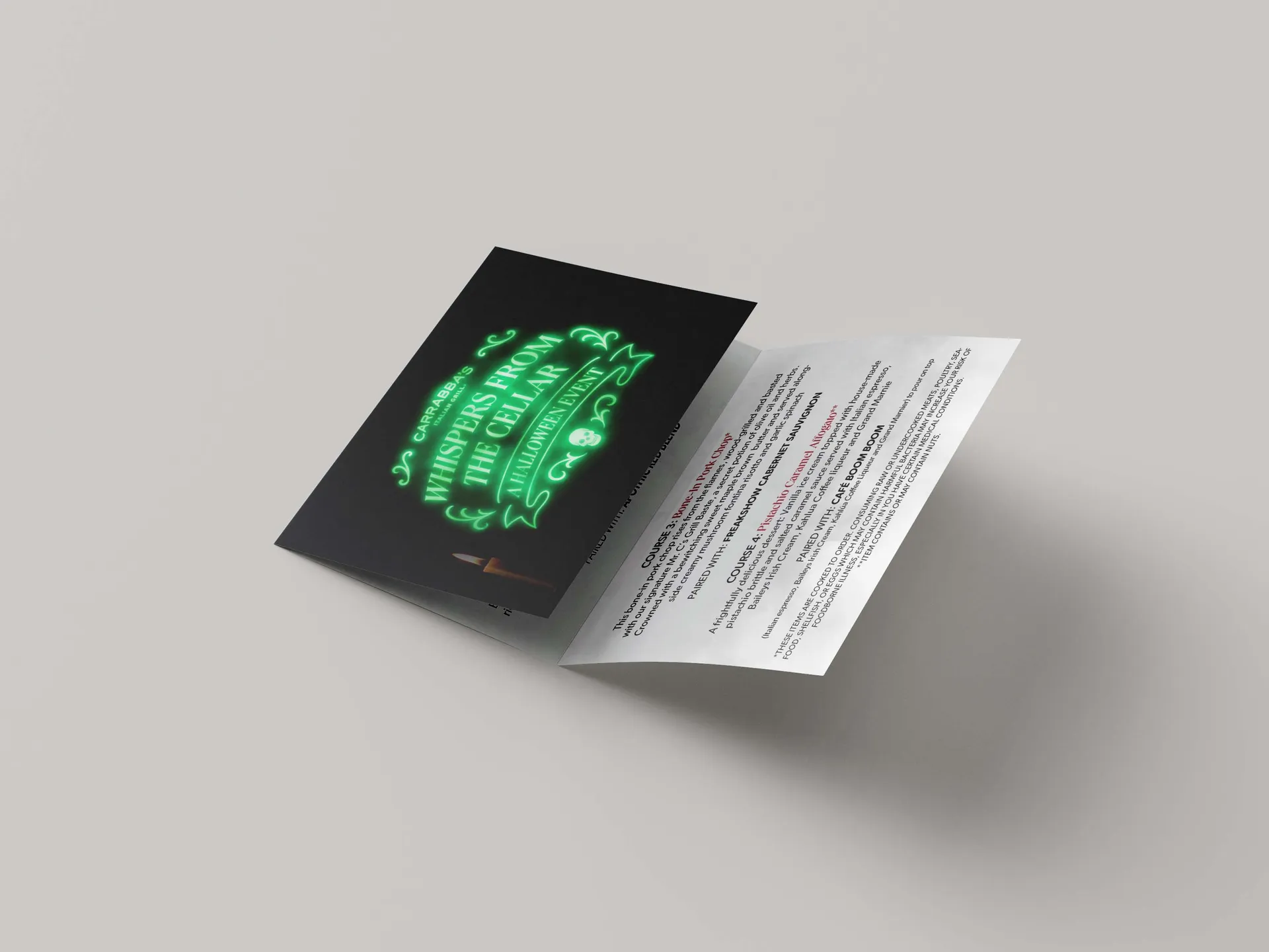
Carrabba's Halloween Event Campaign
Carrabba’s Italian Grill®
For this activation, Carrabba’s needed a tactile, premium handout that would elevate the guest experience at their first ever Halloween-themed dinner event. The goal was to create a piece guests would not only receive — but keep, reinforcing the exclusivity and craftsmanship behind the evening.
Café · Hospitality
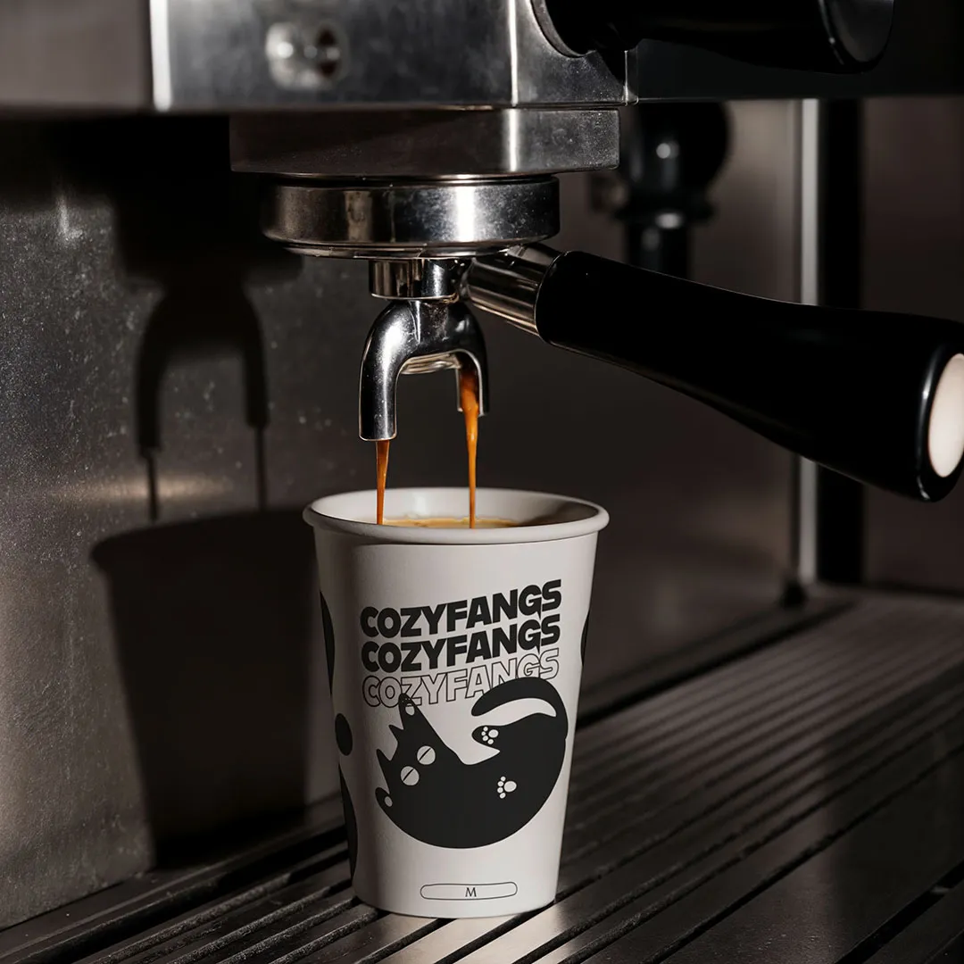
Cozyfangs Branding & Identity
Cozyfangs
Conceptual coffee club and cat café brand that merges minimalist design with playful, cozy aesthetics. The goal was to create a brand experience that feels both modern and emotionally resonant—where clean typography, warm tones, and a whimsical mascot work together to communicate comfort and community. The process involved researching café culture, experimenting with visual hierarchy, and refining illustration styles to strike the right balance between clarity and charm. A rewarding challenge in translating brand values into a visual language.
Technology · Startup
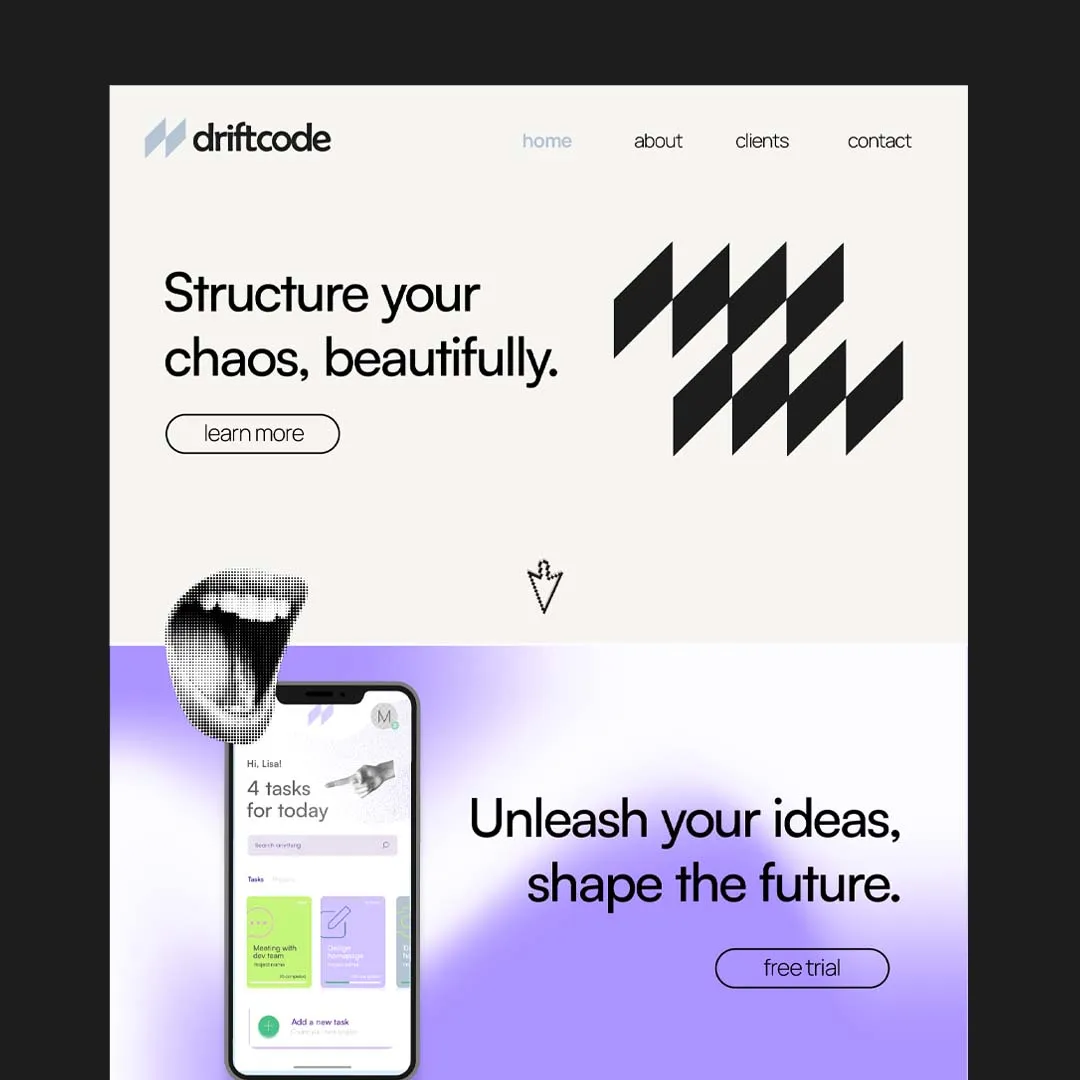
Driftcode Branding Exploration
Driftcode
Meet Driftcode—a bold concept for a modern tech startup that thrives on quirky energy and unapologetically brutalist aesthetics, softened with just a hint of neumorphic finesse. This branding exploration pushes boundaries and blends styles in unexpected ways.
Streetwear · Apparel
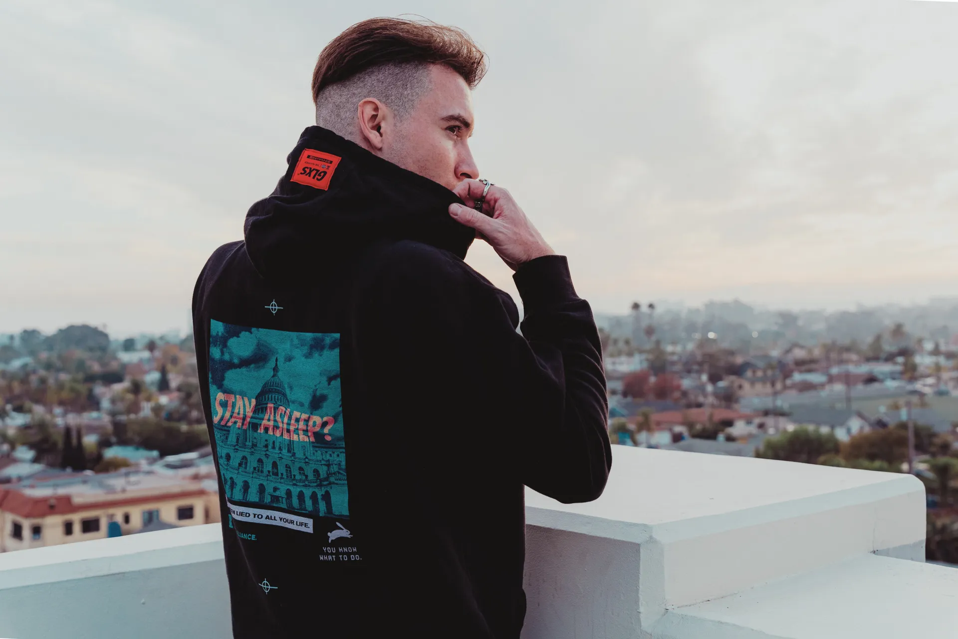
GLXS SS1 'Subliminal Messages'
GLXS
We researched the topics they gave us, drew up several ideas and landed on this super cool modern-dystopian almost esoteric with some cyber-occult undertones. We wanted to really capture the brands messaging of "Anti Authoritarian, red-pill type of conspiracy vibe. We used bold typography to balance and complinent the artwork and also used some sacred geometry as well to convey the sort of ancient knowledge of the truth. These were a complete success and wearer's of the brand constantly were asked about their t-shirts and what they meant, which is exactly what the brand intended.
Cybersecurity · Badge & Logo
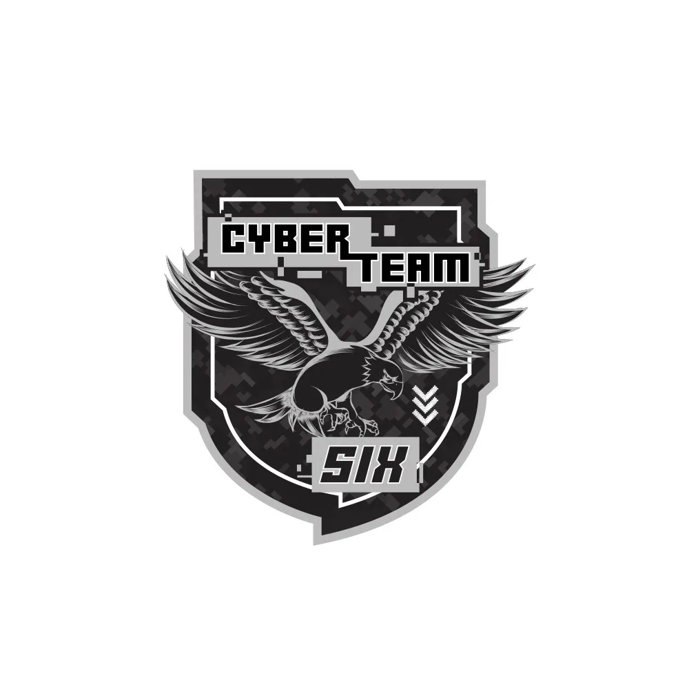
Cyber Team Six Badge/Logo
Cyber Team Six
A Government Cyber Team called Cyber Team Six approached us to create some badges for them Brief: Create a Digital version of a "Seal Team 6" Badge
Cybersecurity · Infographics
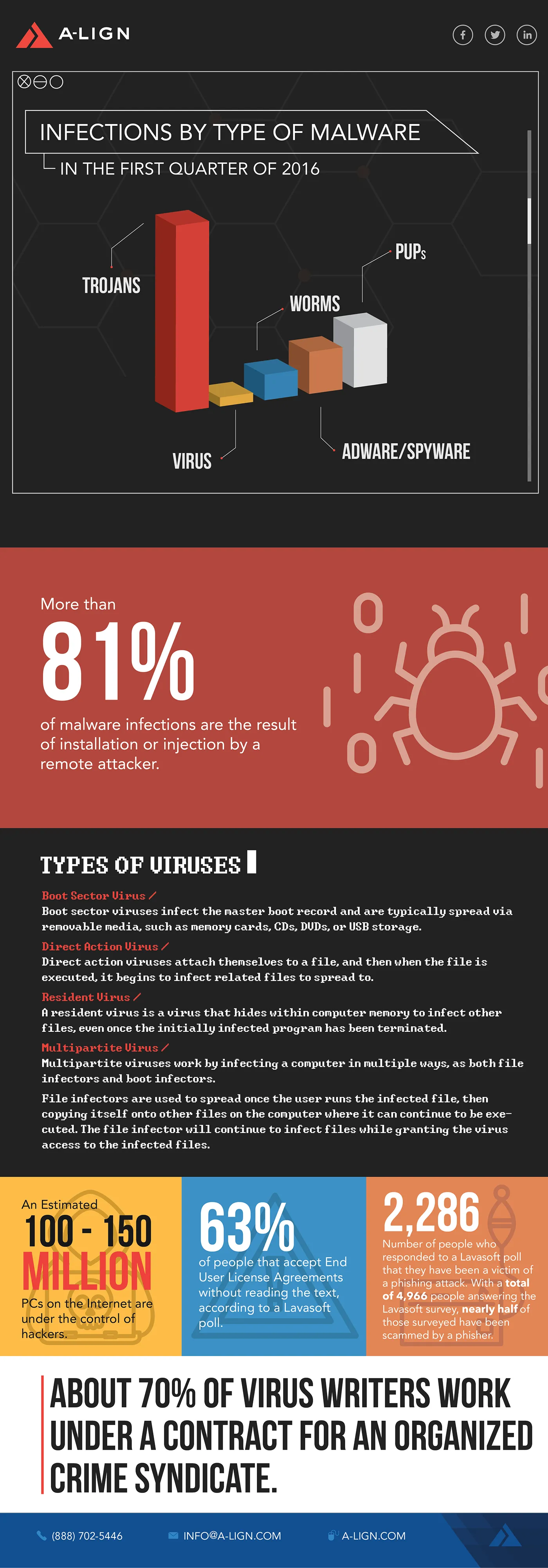
ALIGN Cybersecurity Infographics
ALIGN
A series of cybersecurity and information-security infographics designed to make technical ideas more engaging and accessible.
Healthcare · Identity
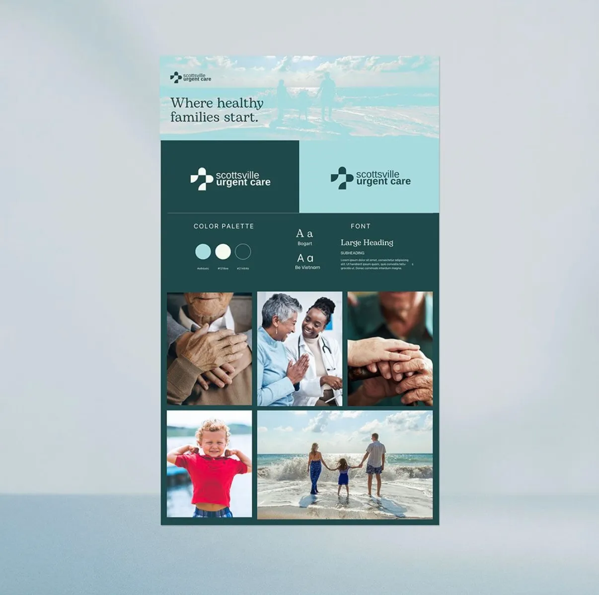
Scottsville Urgent Care Branding
Scottsville Urgent Care
We first did some research into competitors and the general medical practice industry, we wanted to be consistent with industry standards. We then wanted to differentiate from the reds and blues commonly used. Chose to keep it clean, and legible using modern, scientific font duos paired with a moodboard of happy and vibrant families since this is a family practice/urgent care.
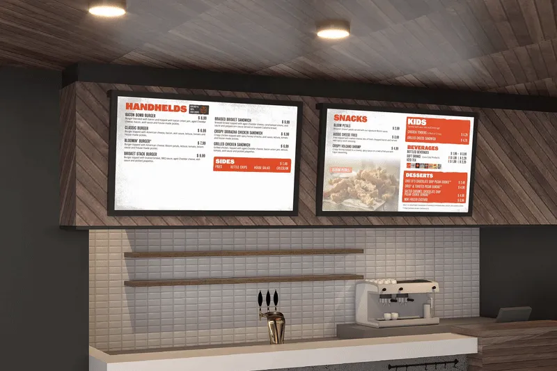
Restaurant · Digital Design
Aussie Grill - Digital Menu Board Screens
Aussie Grill
We took their already established brand guidelines and expanded upon, created the digital menu boards that transitioned between screens. They were meant to showcase the unique fast-casual items.
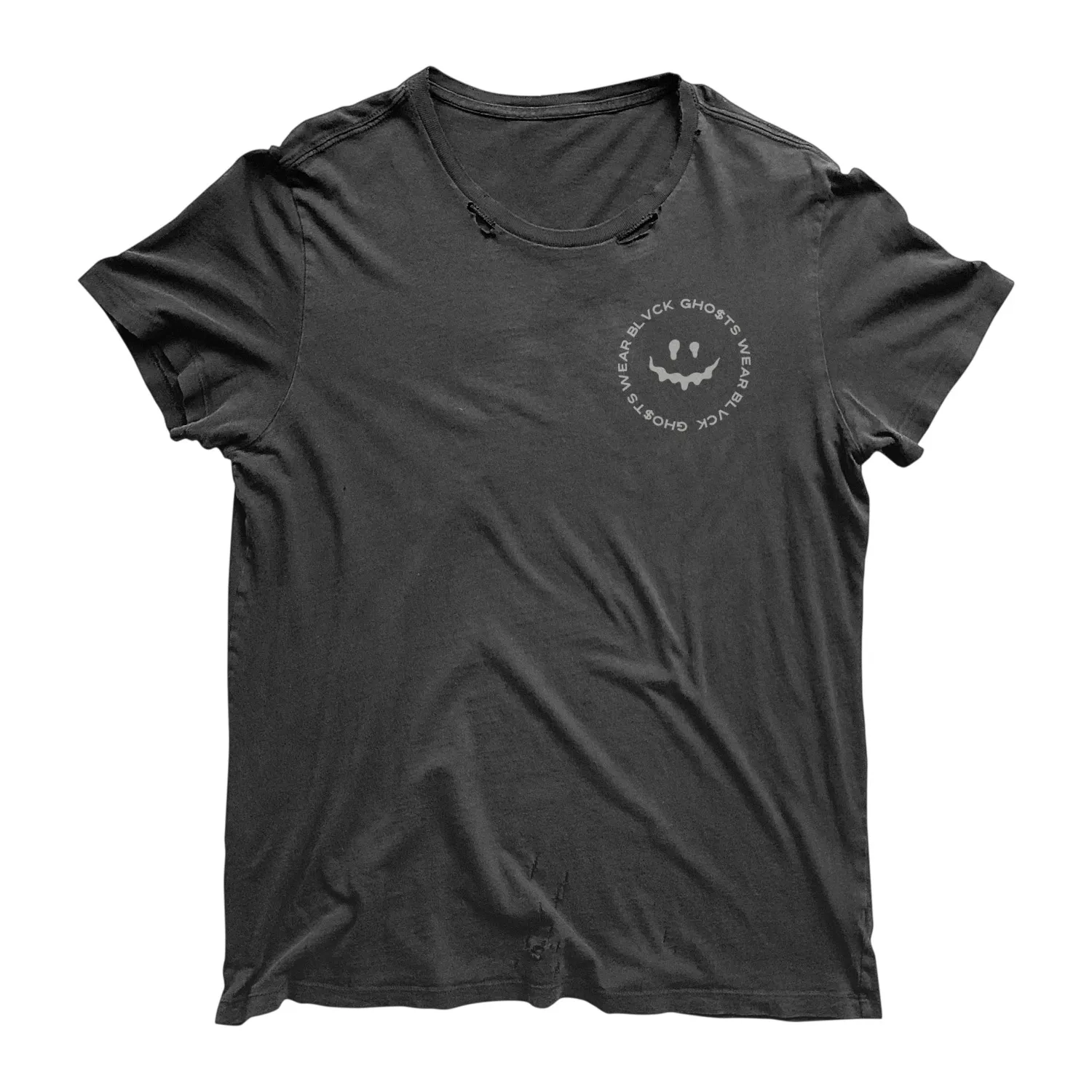
Streetwear · Apparel
Gho$ts Wear Blvck Logo and Inspirational T-shirts
Gho$ts Wear Blvck
We first played with several vintage and modern font duos to really get the look and feel they were after, once we nailed that we collaborate with a copy writer to get some strong, edgy and almost gritty, inspirational few liner quotes that would be perfect for this unique brand.
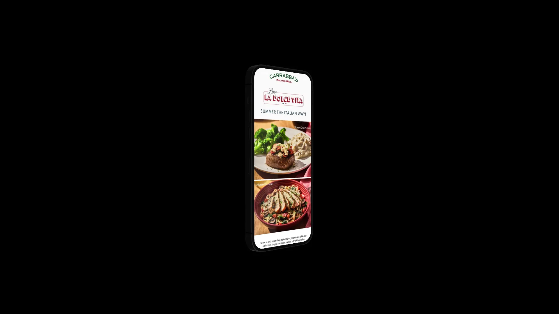
Restaurant · Digital Campaign
Carrabba's Italian Grill® Summer Specials Emails
Carrabba’s Italian Grill®
The goal for this campaign was to highlight the new dishes and capture the inviting mood of summer.
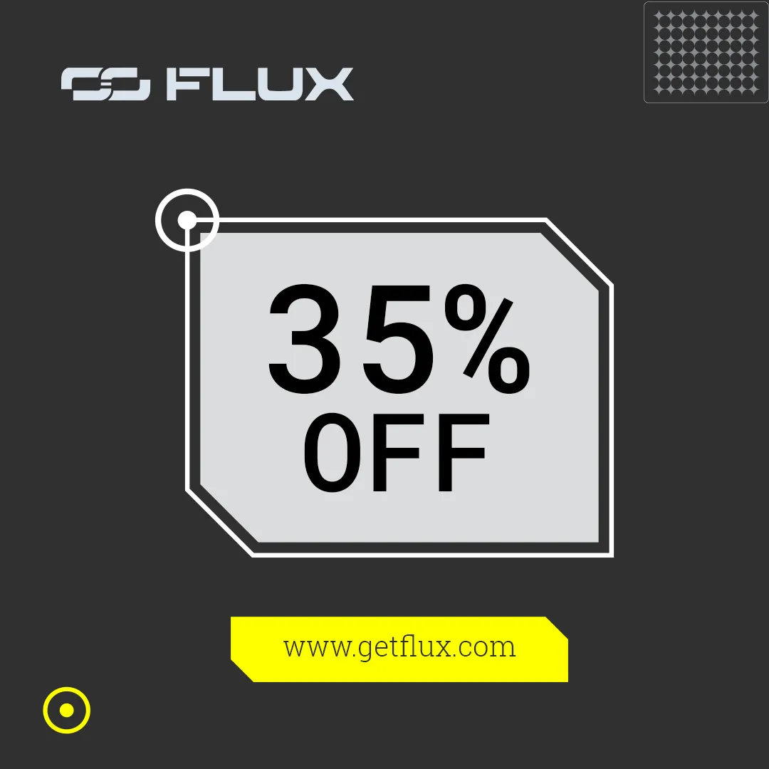
Technology · Transportation
Flux Branding Initiative and Identity
Flux
We started with developing the Tone of Voice and the Brand Mission. Technical and Authoritative: Flux speaks with the confidence of deep scientific knowledge and cutting-edge technology. The language is precise, avoiding jargon to ensure clarity and accessibility, but never at the expense of conveying the advanced engineering behind the bikes. Environmental and Responsible: The tone communicates a strong commitment to environmental sustainability, underlining the impact that every ride has on reducing carbon footprints. There's an earnestness in promoting green energy and a sense of urgency in addressing climate change. Innovative and Forward-Thinking: The voice should always look ahead, focusing on how Flux bikes are pushing the boundaries of what's possible with electric mobility. It speaks to an audience that is excited about the future and eager to be a part of it. VISUAL ASPECTS: We chose a technical logo, hand drew elongated "wheels or energy in motion" as the brand mark. We then moved on to the brand colors and the typography. TYPEFACES: Headline and Primary Font is Roboto - A modern, geometric sans-serif font that exudes professionalism and clarity. It's highly readable and versatile. For the secondary typeface we went with Roboto Slab: A slab serif version of Roboto that adds a touch of authority while maintaining modernity. These went well together with the Tone of Voice and Visual aspects. COLOR PALETTE: A few of the brand colors we chose and why. Electric Blue - Represents technology, innovation, and energy. It's bold and modern. Graphite Grey - Adds a sense of elegance and modernity. It's versatile and works well as a neutral. Solar Orange - Represents creativity and enthusiasm. A little can go a long way in creating a striking visual impact. TAGLINES: 1\. "Ride the Future" 2\. "Electric Innovation in Motion" 3\. "Sustainable Power, Endless Possibilities" 4\. "Efficiency Redefined" 5\. "The Next Generation of Cycling" 6\. "Clean Energy, Unstoppable Performance" 7\. "Pioneering the Electric Revolution" 8\. "Precision and Power" 9\. "Where Science Meets Sustainability" 10\. "Reimagine Your Ride"
Café · Hospitality
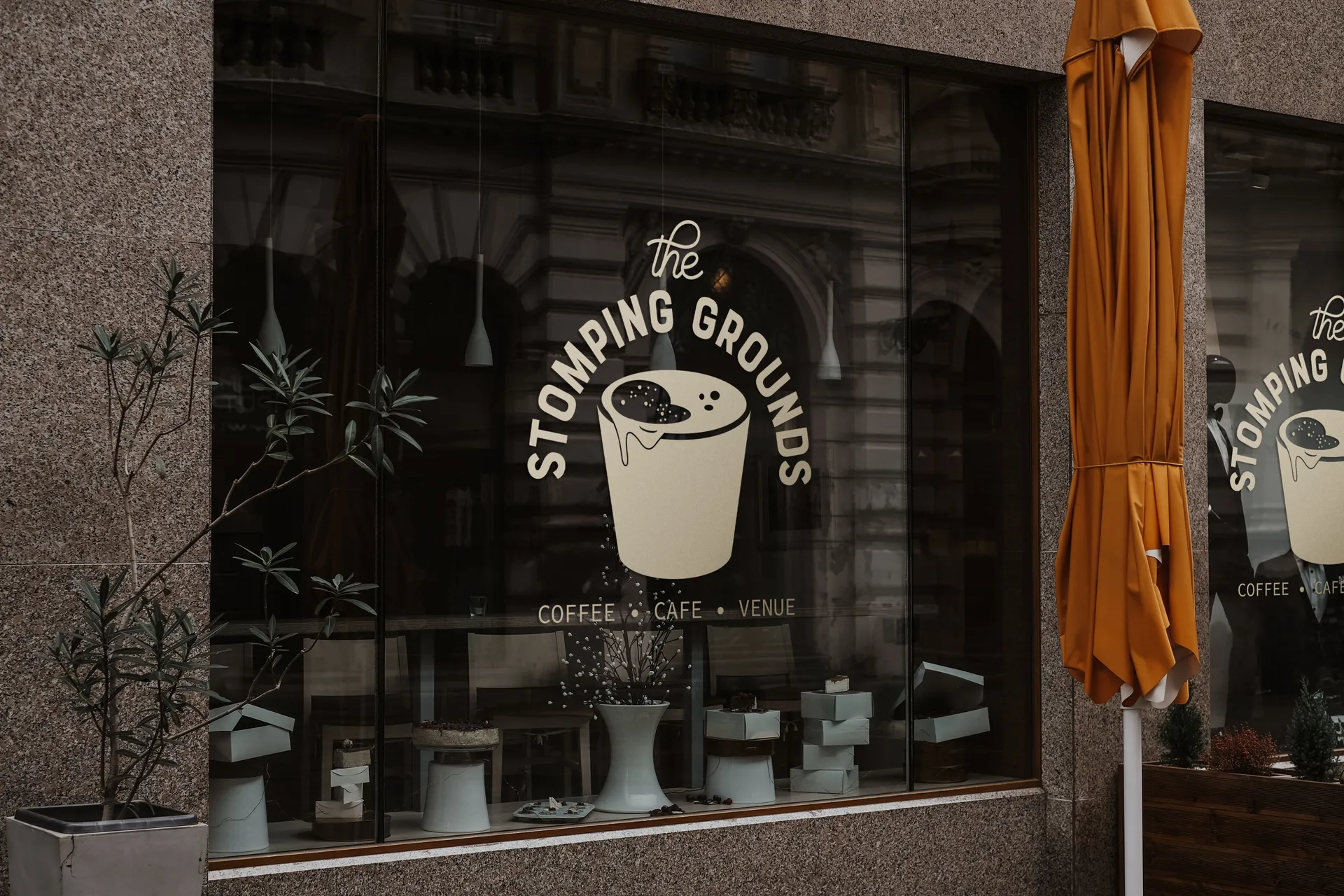
The Stomping Grounds Branding
The Stomping Grounds
We decided to hand draw the logo to illustrate the "fun" and "uniqueness" that is The Stomping Grounds. We invoked the colors of the star, the coffee of course. For Typography we went with a modern-vintage duo to complement the industrial interior design. Being in the arts district, we wanted to speak to the audience and really try to capture that vibe that they relate to. Tone of voice and taglines: "Sip, Stomp, Repeat." "The heartbeat of your daily routine" and "Where beans meet beats" We felt using some fun and witty taglines really spoke to what Stomping Grounds was all about. Brand Video Storyboard: Our playbook again was to capture that aesthetic, we wanted the viewer to really feel what it felt like to be there, in the moment with Stomping Grounds. To taste the coffee, the food, to be immersed in the atmosphere and feel the excitement that Stomping Grounds feel each day serving the community.
Restaurant · Digital Campaign
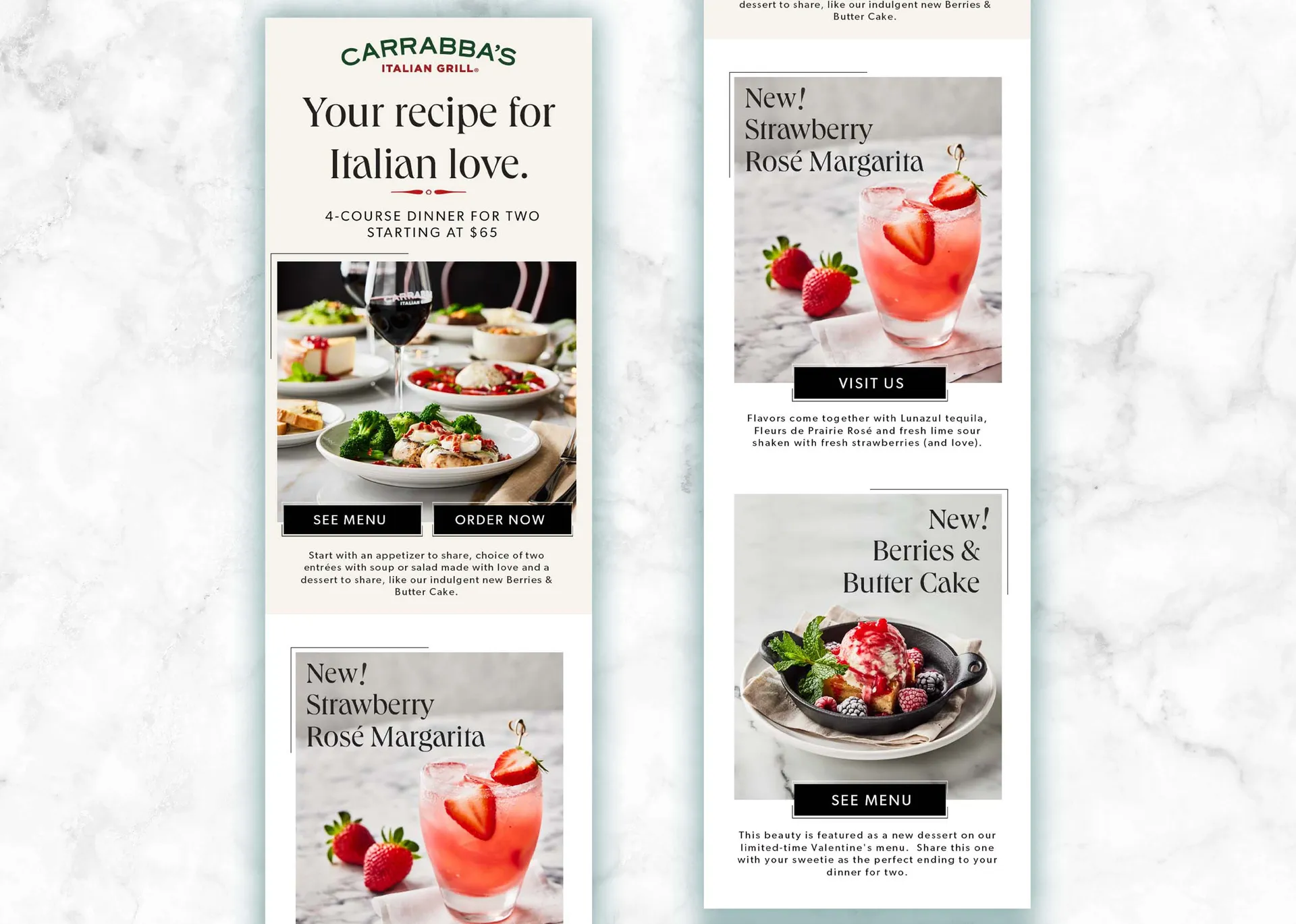
Carrabba's Italian Grill® Valentine's Day Campaign
Carrabba’s Italian Grill®
Carrabba's Italian Grill® celebrates Valentine's Day! The goal for this campaign was to be cute-sy with the brand dish images and make them into mini valentine's. They are also highlighting new dishes rolling out for the holiday of love in an email for customers.
Restaurant · Print
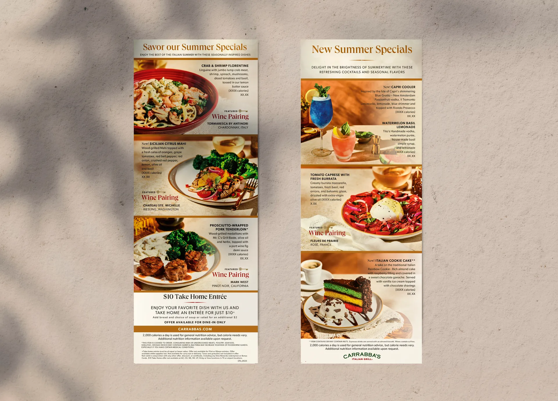
Carrabba's Italian Grill® Seasonal Specials Menus
Carrabba’s Italian Grill®
Carrabba's Italian Grill® offers many seasonal and special occasion menu items. We helped them lay out and envision the customer-facing menus that highlight each special and new dish.
Fitness · Illustration
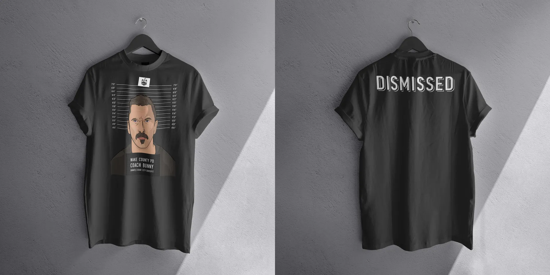
Cigar City Crossfit T-Shirt Graphic
Cigar City CrossFit
Cigar City Crossfit is a popular Tampa-based gym that gets involved in many community events. A lot of the projects they give us are one-offs and sometimes silly. Longtime clients of ours, they trust us to help bring their creative visions to life. We took this photo they supplied and ran with it.
Restaurant · Branding
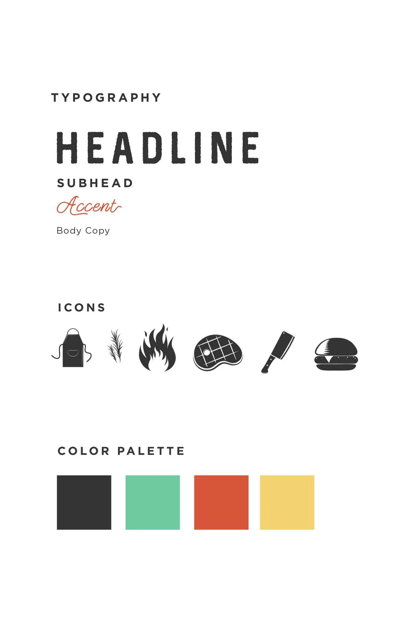
Rocko's Modern Burger
Rocko's Modern Burger
We wanted to capture the feeling of an old fashioned diner, so we incorporated some rust textures to go with the vintage color palette. We wanted to focus on the food, the food is unique so it needed to be the hero, the main focal point. We chose the two man fonts in the logo because of the invocation of 1950/60s they brought forth.
Luxury · Branding
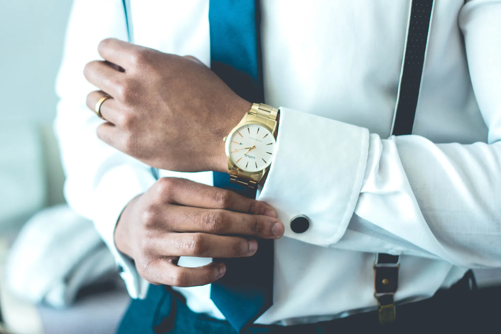
ST. RISE LUXURY BRAND
St. Rise Luxury Watches
Branding study for a Luxury Brand. We wanted to explore every aspect of this brand - how they would integrate a not-so-typical loud color into their identity and what typefaces and patterns they might use and how that would all tie in back to the logo and the overall aesthetic.
Coffee · Branding
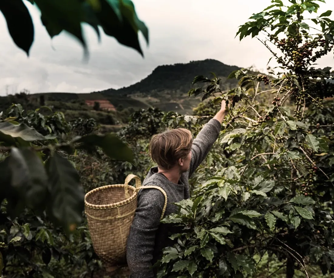
Cantata Coffee Roasters Branding
Cantata Coffee Roasters
Exploration of branding for an artisan cafe/coffee shop that roasts its own beans. We wanted to keep this minimal while using some nice abstract patterns. Everything from the colors to the patterns - We wanted the end user to visualize the coffee to the point they can almost smell it just by looking at the branding. Utilizing yummy textures and macro-shots, this project made us yearn for a tall cup of brew.
Restaurant · Branding
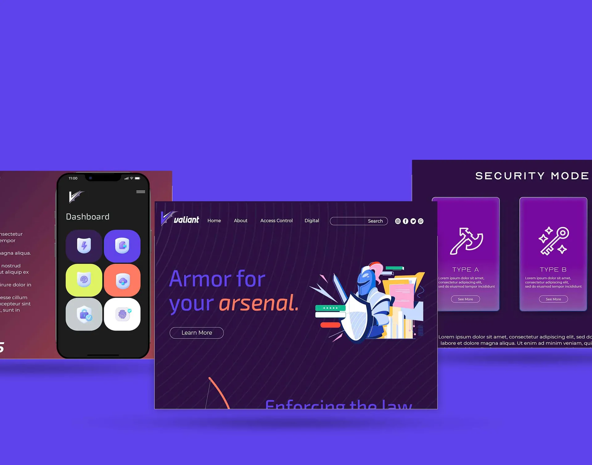
Valiant Network Security
Rocko’s Modern Burger
Its personality is inspired by Medieval knights, castles and the art of battle. In the forever progressing digital landscape, battle tactics need to constantly evolve and reach new heights. Knights were the symbol of bravery, strength and skill in battle. They were often employed to defend the weak and vulnerable as well as protect assets; your domain. Your company is your asset, it should be protected by the same prowess Medieval knights exuded over the land in ancient times. We went with a bold color scheme, that included a few brighter colors to be used as highlights. The art style we went with was more of a surreal comic type to inspire a narrative that went beyond the ordinary. To use fantasy-like art, We felt we could take the audience on a journey into the past realm we're invoking within this brand. we wanted all taglines to be serious and strong, yet make references to the past and still tie them into modern times..
Applications · Branding
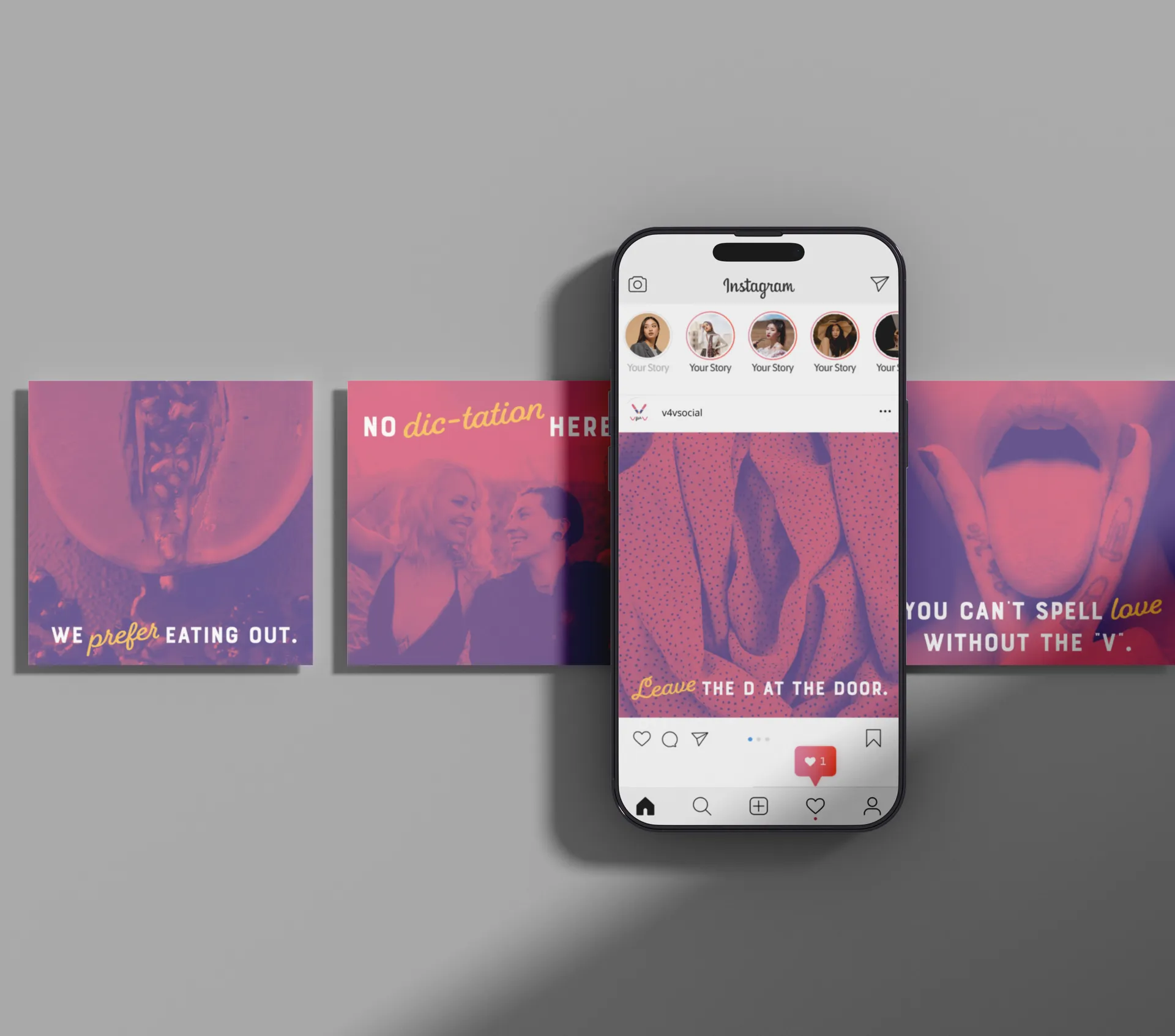
v4v Social Network Branding
v4v Social Network
We developed the logo, branding and tone of voice for V4V, a same-sex dating website that needed a quirky and witty edge. Personality was to be laid-back, fun and approachable. We shaped the way the brand would speak in advertising and externally; flirty but not vulgar, funny and witty. We sourced a handful of concept and lifestyle imagery to support the uniqueness of this brand.